As a designer, when the time comes to build, redesign, or enhance a website, you have many elements and opinions to consider. Karol K defines the challenge designers are presented with best:
“On one hand, you want your work to always look great, and to always deliver an optimized browsing experience to the visitors. But on the other, there’s only one measure of quality in existence for ecommerce. That measure is conversion rate. In other words, a well-designed ecommerce website is one that converts and makes sales.”
Here are 5 ecommerce design principles to ensure a solid foundation for a conversion-driven website.
1) SIMPLE AND FUNCTIONAL NAVIGATION
When approaching the navigation design, users are more likely to convert by finding what they need within a few clicks. Test your sitemap and menu structure to check for unnecessary pages and actions in the user flow. Try to limit your header to the following elements:
- Your Logo
- Between three and seven main navigation links (Main categories to convert)
- Simple one or two, direct words *Consider your SEO Strategy here
- Between three and five utility navigation links (Secondary actions for returning users)
- This is where links such as My Account, Login, Contact Us, News, Cart should live
- Prominent Search Bar functionality
With concise navigation options and categorization, users are able to intuitively interact with your site and are driven further down the path to conversion.

2) INTENTIONAL MINIMAL DESIGN
The popular phrase, “Less is More” holds true when it comes to the UX/UI of each page of your site. Users will enter your site through a variety of landing pages, not just the homepage. Therefore, it’s imperative that all elements/modules and content are clearly executed in the design and are necessary to bring the customer one step closer to converting.
Although the importance of whitespace has been established for years, it remains an essential principle to ensure success. Whitespace is just as valuable as imagery and content, and the key is to strike the proper balance that allows users to easily digest a page, get more out of what they see, and drive down the path to conversion.

3) CONSIDER CARD DESIGN
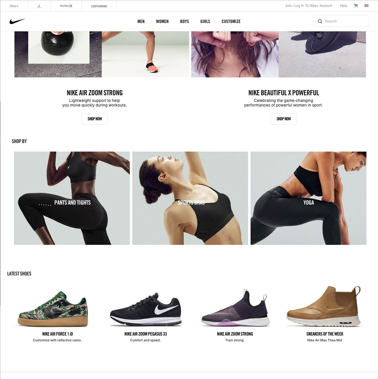
Going into 2017, we will continue to see websites that utilize card design, simply because it serves multiple purposes.
Naturally, cards are easier to scale for all breakpoints – whether the elements are increasing or decreasing. This eliminates the fear that our designs are not scaling properly on all viewports and devices.
Cards also play into principle #2, Intentional Minimal Design as they are a contained element that are cleanly and consistently executed, making it easier to pull a user into that piece of content and take proper action to convert.

4) CLEAR CALL TO ACTION
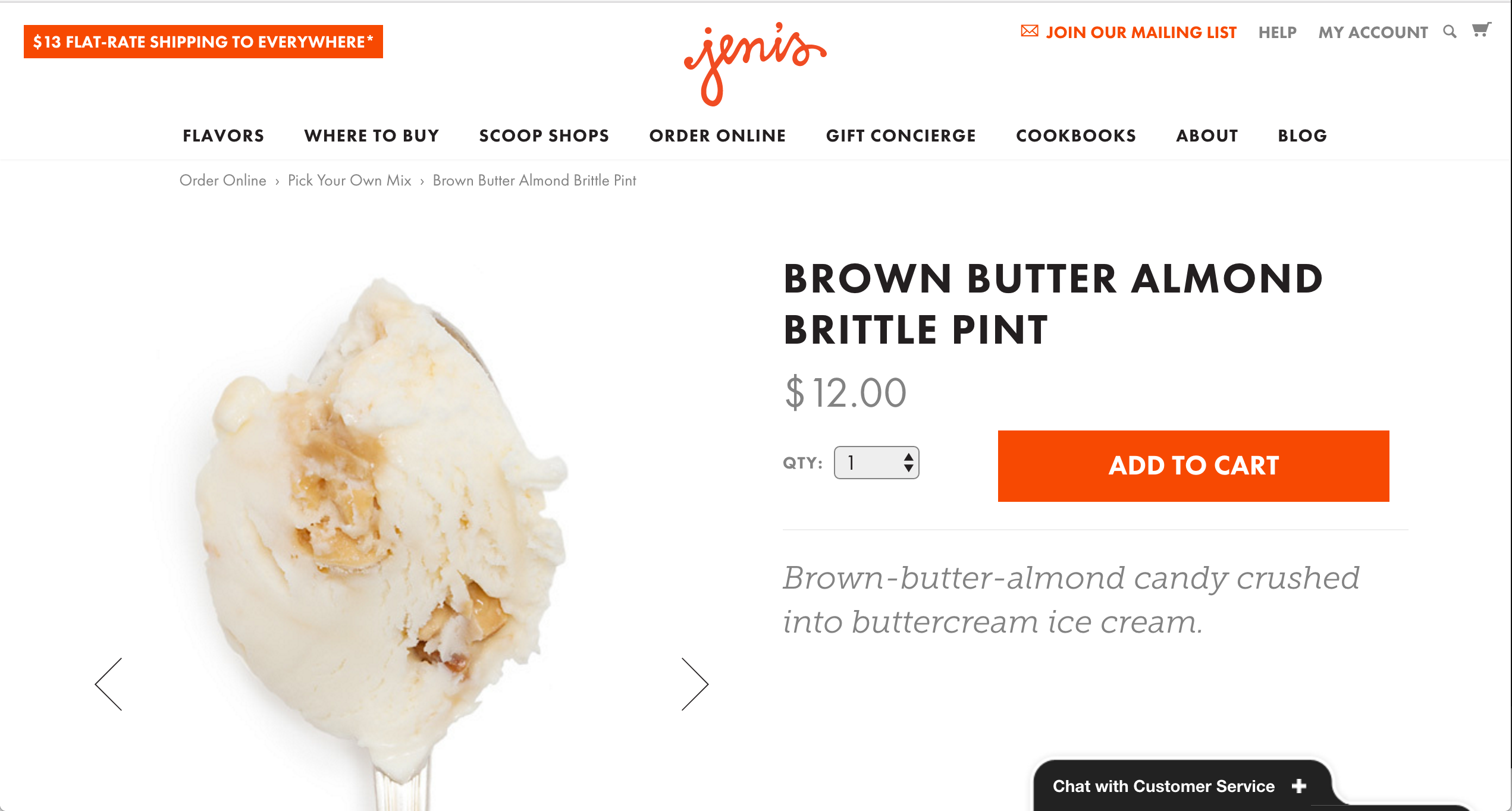
By now, you’ve got just about everything else in place. Your call to action is the most important element on each page. You must provide a highly visible way to entice the user to click and convert. Every product thumbnail should have a bold “Add to Cart”, or “Shop Now” (for configurable products that cannot be added instantly) button to provide as few clicks as possible.
As for your Product Detail page, the CTA button should be prominent in size, above the fold, and a highly contrasted color. Don’t give the user any reason to drop off at the final stages of completing their purchase.

5) PAINLESS CHECKOUT PROCESS
By now, most, if not all ecommerce platforms allow for a one-page checkout implementation. This allows the user to instantly understand what is required to complete their purchase, with a clear outline of the steps to do so.
Best practice includes a progress bar or design treatments that clearly highlight what steps are complete and what needs to be done next.
Keep the amount of form fields minimal, by only requiring only the essential information needed to process the order. Providing confirmation after the fact with a Thank-You page is an easy way to show the completion of the order, but also turn a user into a repeat customer by displaying promotions or related products.

***
These 5 ecommerce design principles for success give you the foundation you need to increase conversions on your website. However, these principles alone are not going to provide overnight success. Continue to look into performance data and A/B test a variety of site elements in order to drive the proper UX/UI enhancements and further optimize each page for conversion.


